girls’ last tour and shading
In my recent exercises making comics, I’ve been studying how tkmz achieves the specific graphical style that he displays in Girls’ Last Tour, which I find very intriguing and has been a great learning experience. I’ll attempt to briefly list out my findings.
. . .
The first thing that I think is worth mentioning is a high-level idea. The shading is non-literal in the way it interprets colour. By this, I mean that my first intuition when making comics in shades of gray was to treat them as if it was a black-and-white illustration, and using the shading as a way to convey the details of rendering. Other artists do this kind of style to great effect, but tkmz, not-uniquely, but quite interestingly, does not. The shading in GLT is distinctly non-literal, and always focuses on creating contrast and guiding the eye of the reader.
This non-literality is apparent in every aspect of the shading. Blocks of colour often have hard edges and seldom are specific in their depiction of three-dimensionality, instead more intent in conveying broad volumes rather than specific volumes. Dark shades of gray are typically reserved for colouring the clothes and headgear of the characters, and distinctly separate them from any kind of environment, which has light-shadow flatly rendered through white and light gray (much like the skin of the characters). Quite similarly, when the characters are absent or otherwise small or hard to pick out in the frame, the rendering tends to illustrate light-shadow through white and light gray.
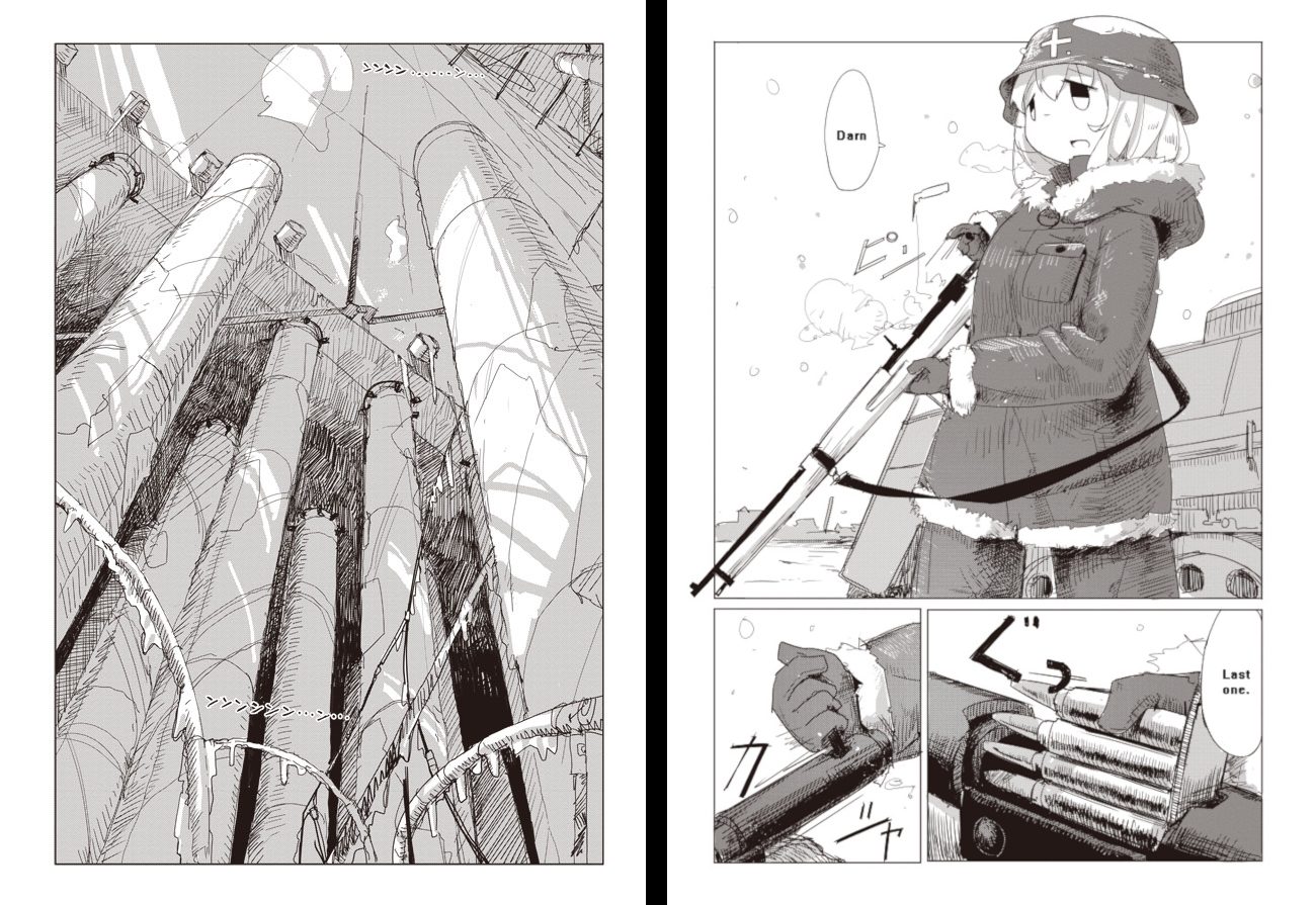
The above scheme serves quite decently as a rulebook on shading daytime scenes. Dark grays for characters in specific spots, light grays for environment detailing. Occasionally, when relevant, this system might be also be broken, such as when conveying distance and depth.
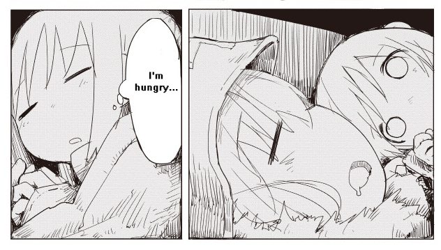
Shading deep dark settings is done through enveloping the frame in black and removing all volumetric information by flatly filling in the drawing with light gray, effectively conveying the flatness of sight in the dark.
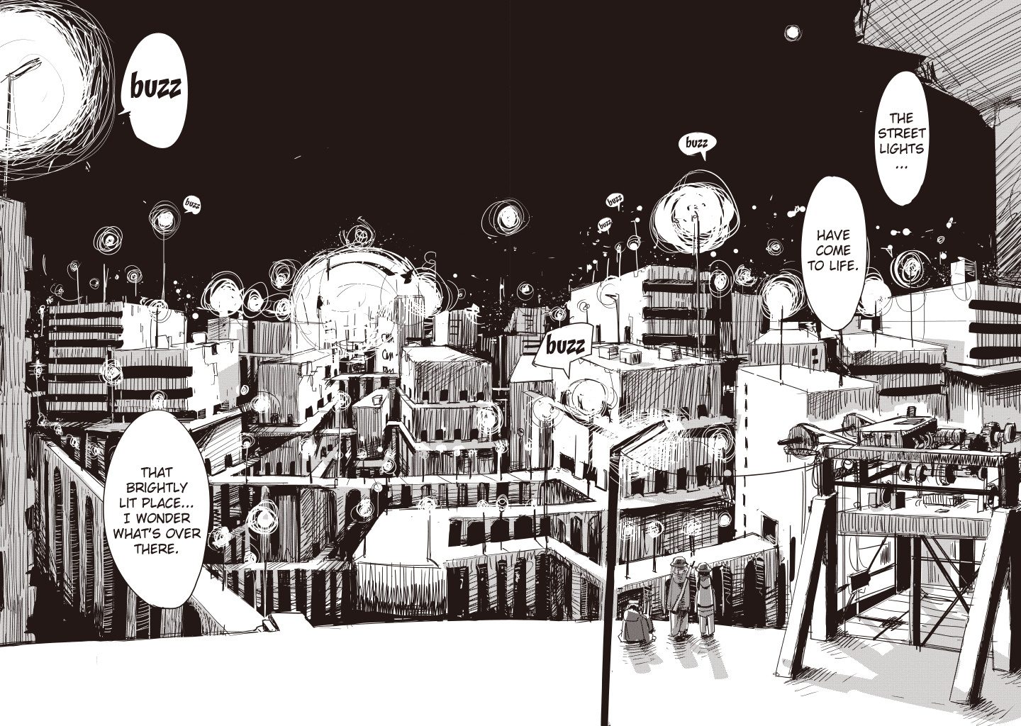
However, when there is light in these dark settings, it shifts the perception of darkness. Skies and backgrounds may become dark gray rather than black, and normal rendering apply to the frame. Alternatively, they may remain black, and increase contrast to the lit areas.
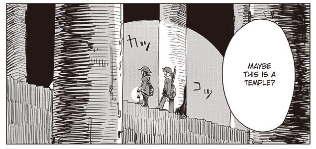 Notably, when the light flickers, such as with fire, that is conveyed through chaotic hatching.
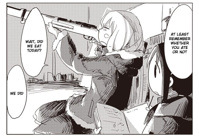 Making use of such a simple system of rendering has an interesting side-effect – the simplicity of most illustrations is deeply contrasted against more carefully rendered illustrations, which in turn feel a lot more awe-inspiring than they otherwise would.
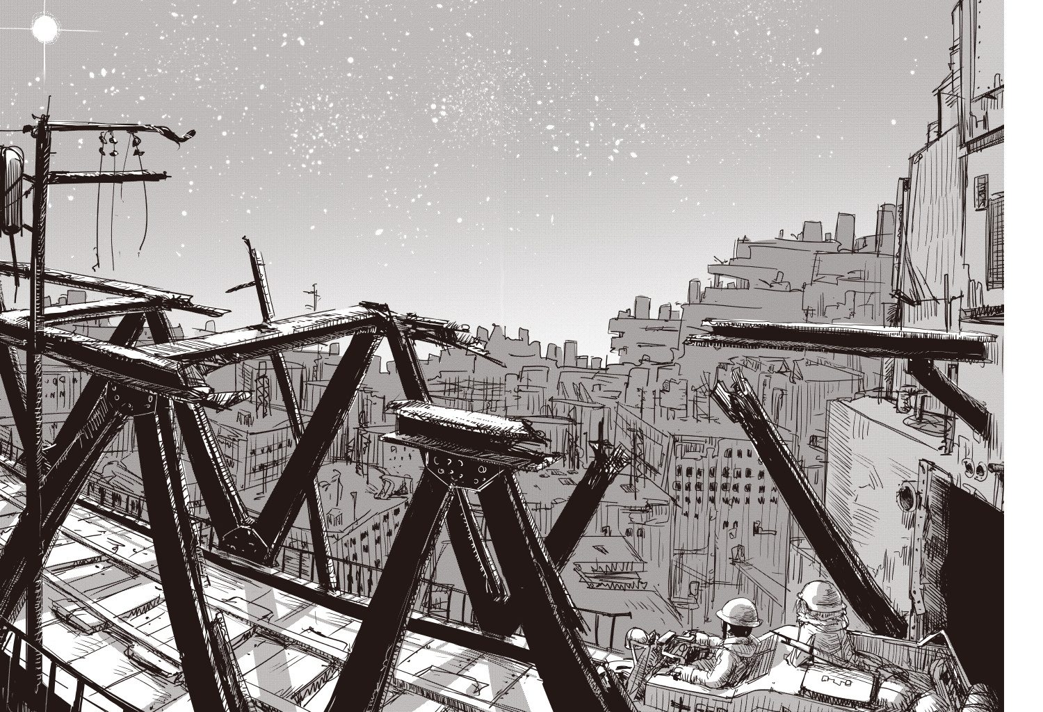
tkmz’s style is rather unique among the manga landscape, in part because of the non-literality of his shading. One thing that I feel deserves further exploration from me at a later date might be how blacks, specifically, are used, as they have quite a few applications that I haven’t systematized or understood yet. However, that is for later, and for now, this little summary of my findings has proven useful to me… and I hope it proves useful to you as well.